Relationships on the Dashboard 2.0
The Relationships feature allows you to understand how feedback categories relate to each other. For example, in cases where some categories have a positive sentiment and others have a negative sentiment, you can visualize links between them. This helps you explore the relationships within your data and understand how different aspects may influence one another.
When identifying areas that need attention, these relationships can provide useful indicators of where to focus. They can also help you anticipate how a change in one category might impact not only that category but also others that are closely connected.
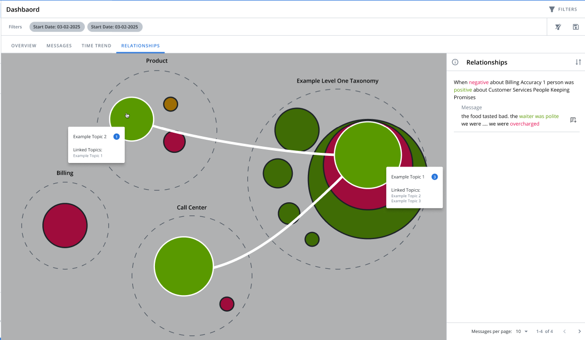
To access this feature, click Relationships on Dashboard 2.0.
-
The large dashed circles represent the top-level categories at your organization (for example "Billing" or "Product). The colored bubbles illustrate positive (green), negative (red), and neutral (amber) feedback which mentions specific phrases.
Example: Under the Call Center category, you will see bubbles for words related to the service, such as "Polite" or "Helpful"— these bubbles will be larger the more those words are used in your feedback.
-
The size of the bubble reflects the number of times the corresponding word has been used in your feedback.
-
Hover over a bubble to see the number of total mentions that word received in your feedback and to see a summary of common terms used alongside it.
-
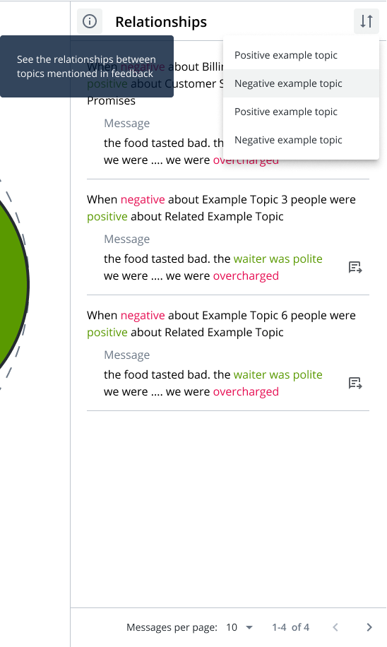
Click a bubble to learn more about how it connects to other feedback topics—the Relationships panel on the right shows which categories are most frequently associated each other, in either a positive or negative sense.
-
The At-a-glance panel shows examples where the linked categories are both mentioned.
-
On the Relationships panel, you can:
-
Filter the feedback items by positive or negative sentiment by clicking
 icon.
icon. -
Go to the message on each feedback item by clicking
 icon.
icon. -
Adjust the number of feedback per page at the bottom of the panel.

-